Seattle's Best Bakery Branding.
This project was born from a 4-Day Design Challenge and later expanded into a complete company brand package for an imaginary bakery company based in Seattle, Washington. The project aims to create a vibrant, playful brand identity for the fictitious business named Seattle’s Best Bakery.
Role: Logo Design, Brand Identity, Graphics/Icons
Credits: James Van Arsdale (Faculty Advisor)
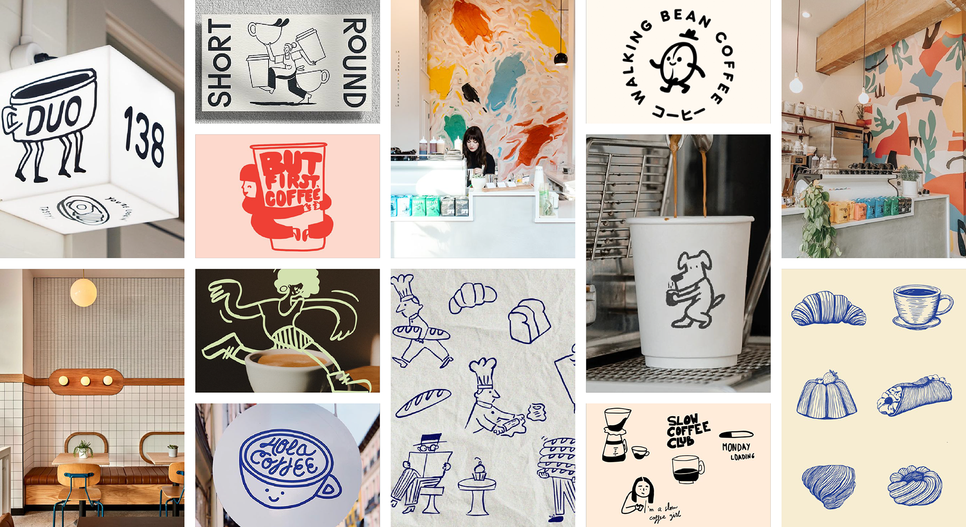
01 MOOD BOARD
When developing the brand logo and icons, I drew inspiration from the line art/outline illustration style I encountered during ideation. I appreciated the style’s youth-like appearance and the strong contrast between the think lines of the illustration and its background.
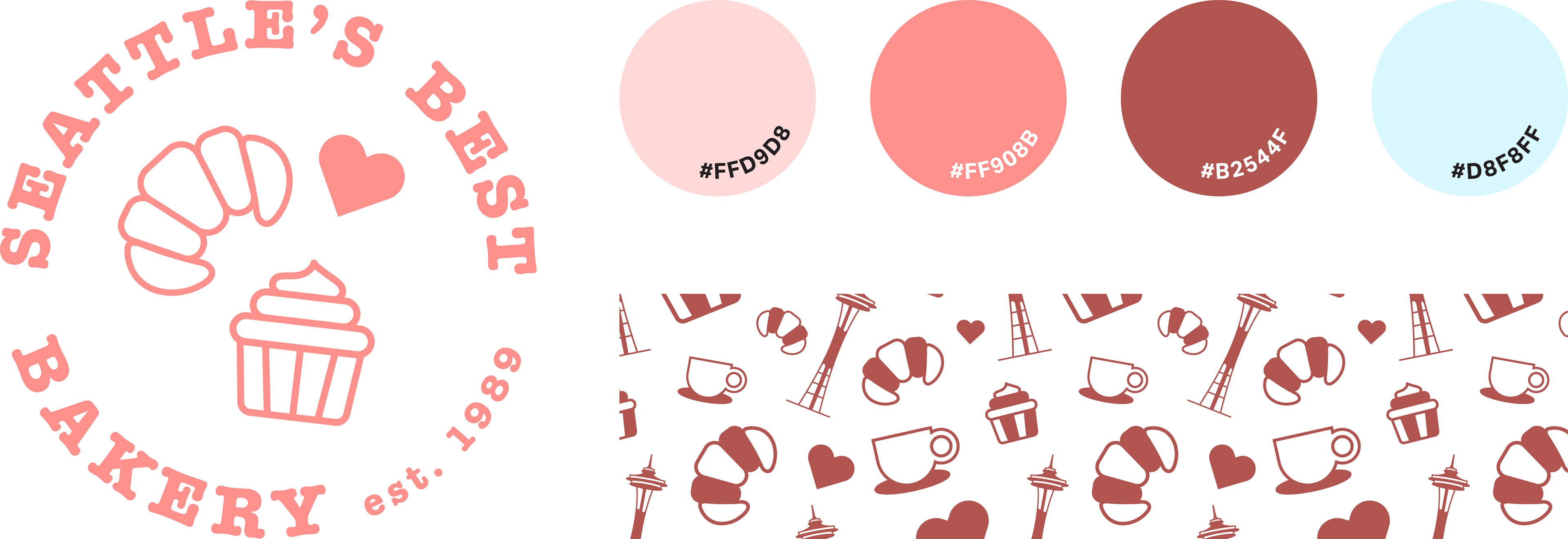
02 BRAND'S VISUAL ELEMENTS
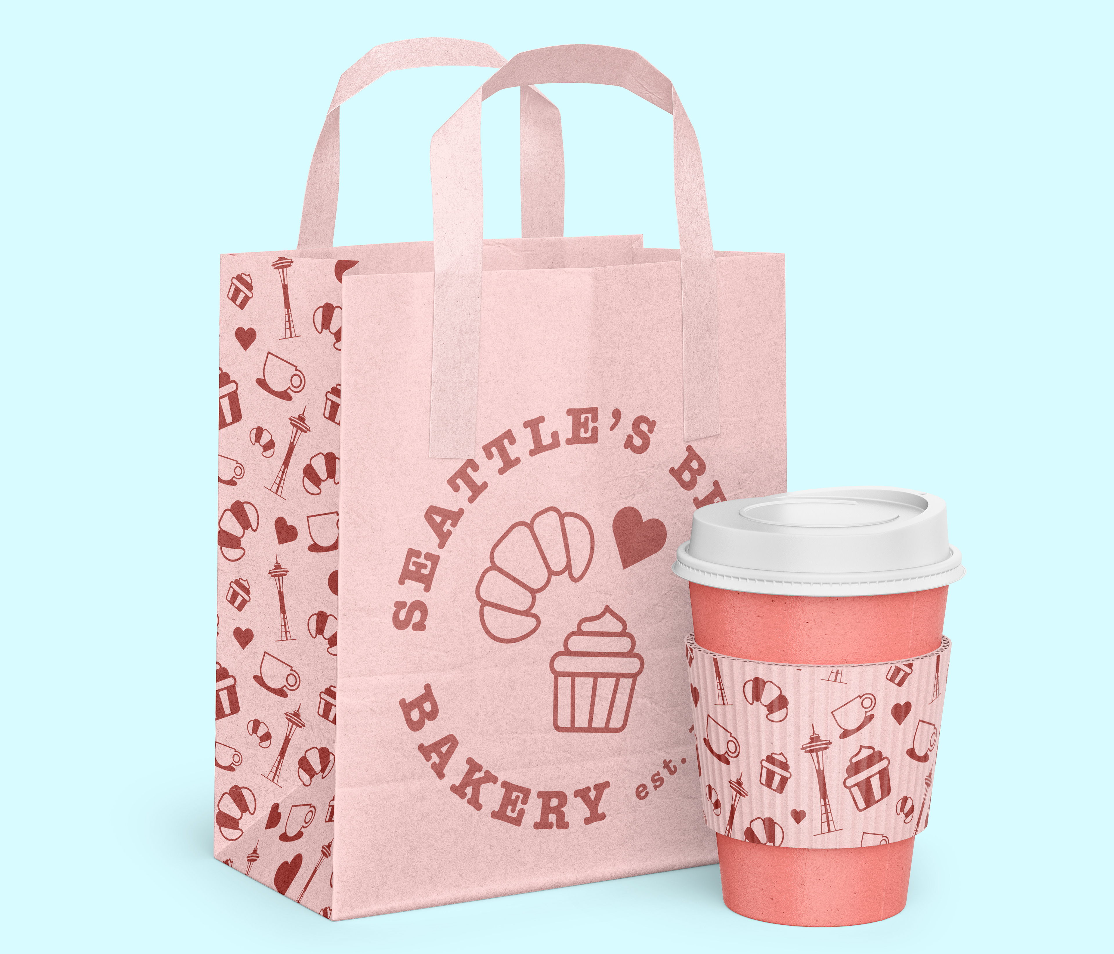
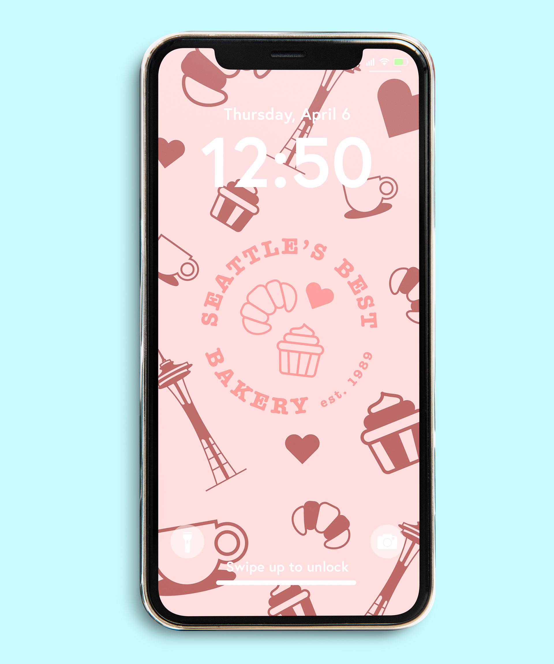
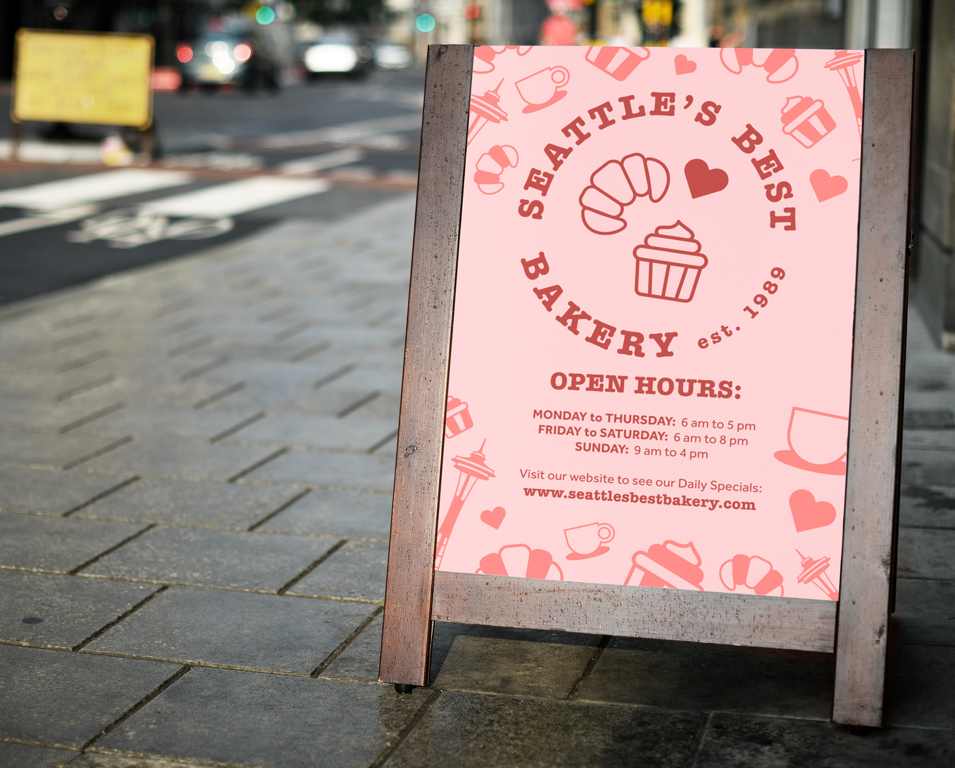
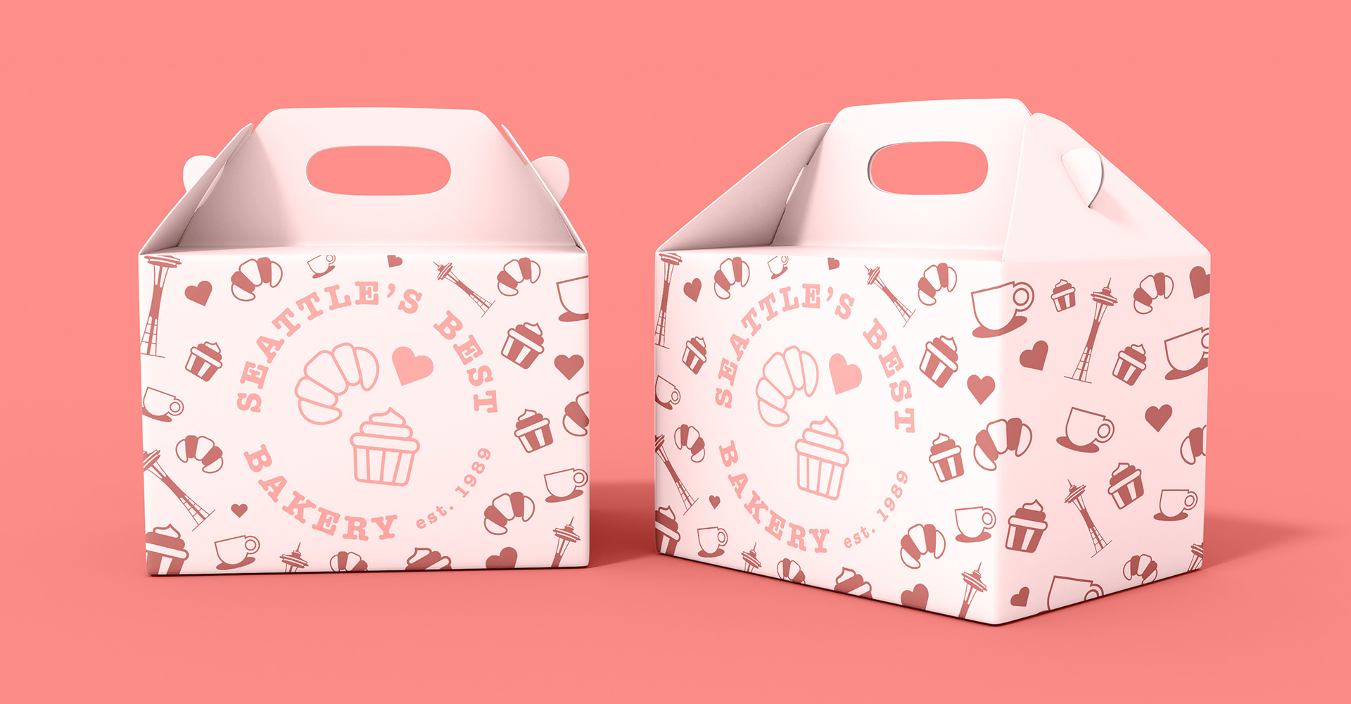
The brand package includes a logo design, a full-color palette, five icons, a pattern design, and branded materials such as food containers, t-shirts, signage, packaging tape, and more. The brand color palette features three primary colors, misty rose, light red, and chestnut brown, and one accent color, light cyan. The palette aims to establish a playful and inviting brand personality to attract customer’s attention and create a lively and cheerful experience.
The brand icons in the logo and pattern design highlight some of the signature products offered by Seattles Best (e.g., lattes, cupcakes, and croissants) while incorporating recognizable landmarks found in the company’s hometown, Seattle, Washington. The icons can either be used separately, or solely in the pattern design on branded products.
03 BRANDED MATERIALS