Raíces Program Logo Design.
The project aims to create a logo design for the recently established Raíces Program at Santa Barbara City College (SBCC). Raíces is a Title V HSI (Hispanic-Serving Institution) grant-funded program that strives to cultivate scholars through education and empowerment.
The clients, Raíces's Program Leaders, were looking for a logo design that was mindful of indigeneity, paying homage to those who came before and connecting the present to past generations and ancestors in the Latine community. During the project, I worked with a design team and participated in multiple client reviews to develop the final logo and brand identity.
Role: Logo Design, Brand Identity, Typography
Credits: Ziv Taylor, Madeleine Ignon (Faculty Advisor), Melissa Menendez (Client), Sergio Lagunas Garcia (Client), Lydia Aguirre-Fuentes (Client)

01 PRELIMINARY DRAFTS
Two main themes discussed with the clients early in the design process were interconnectedness and indigeneity. The clients specifically asked to focus on Pre-Columbian imagery and symbolism for the logo design. To explore indigeneity, I began researching common visual characteristics unique to the artworks created by the indigenous peoples of Pre-Columbian America, notably the Inca People.
A considerable source of inspiration for the logo drafts came from the theme of interconnectedness. As mentioned, the client asked to focus on Pre-Columbian imagery to avoid literal motifs, such as trees and root systems. One force in nature that interconnects all systems and living organisms is energy. The flow of energy holds the integrity of all processes to ensure the survival of the larger environmental community. To incorporate the concept of energy, I began working with different sun shapes and patterns.

02 REVISED LOGOS
During our second meeting, the client selected preliminary designs 1, 2, 3, and 5 for further exploration. Based on their critiques, logo designs 1 and 5 were unchanged, while logos 2 and 3 received further edits. For logo 2, I made the center eye appear more human-like by making the shape more ovate and elongated, increasing the pupil size, and adding a crescent moon-shaped iris. In logo 3, I removed the center ring shape to reveal the underlying radial pattern and inverted the pattern's stroke and shape colors. These edits amplified the sun motif, while also imbuing a floral look to the idea.

03 FINAL LOGO AND BRANDING
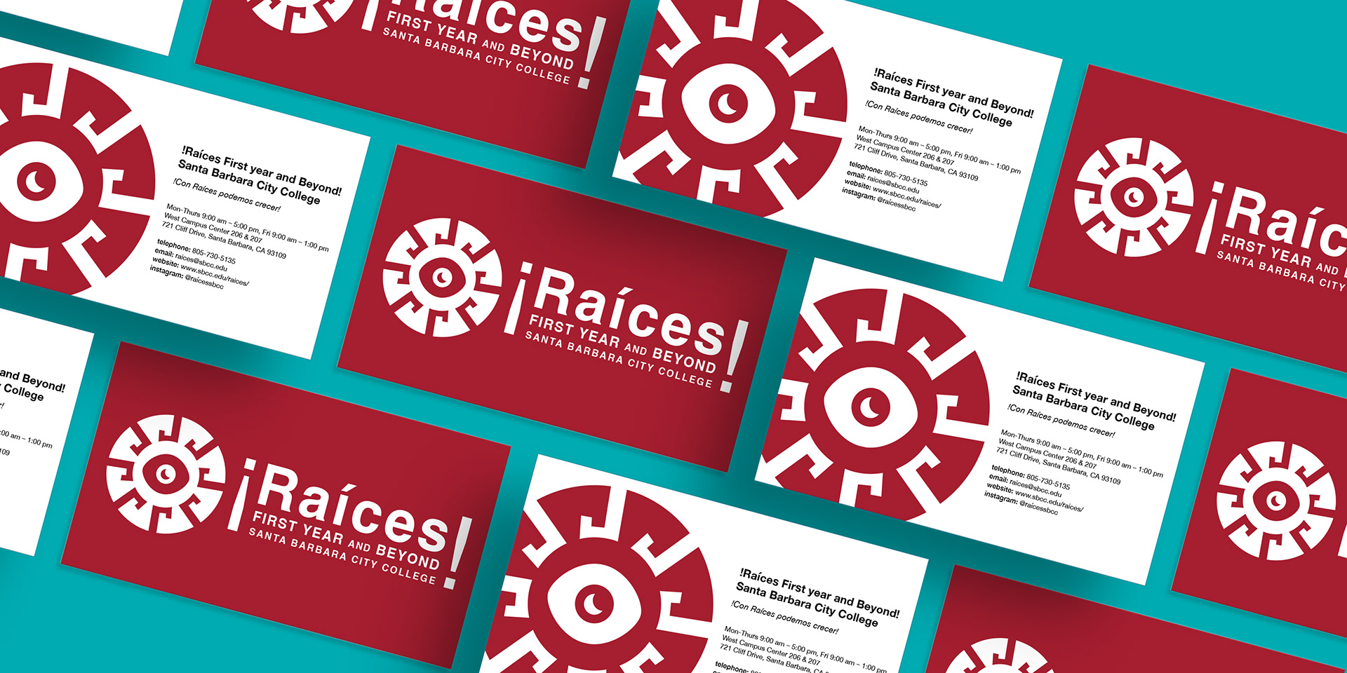
The client’s final logo selection was design #2. The clients appreciated the design’s association with the sun and energy in nature to represent the theme of interconnectivity. Additionally, they valued the connections made to indigenous peoples from America. The angular and geometric pattern work found within Incan artwork helped to inspire the angular sun rays for the watermark. While the crescent-shaped iris for the eye connects to the astrological achievements the Aztec people contributed.
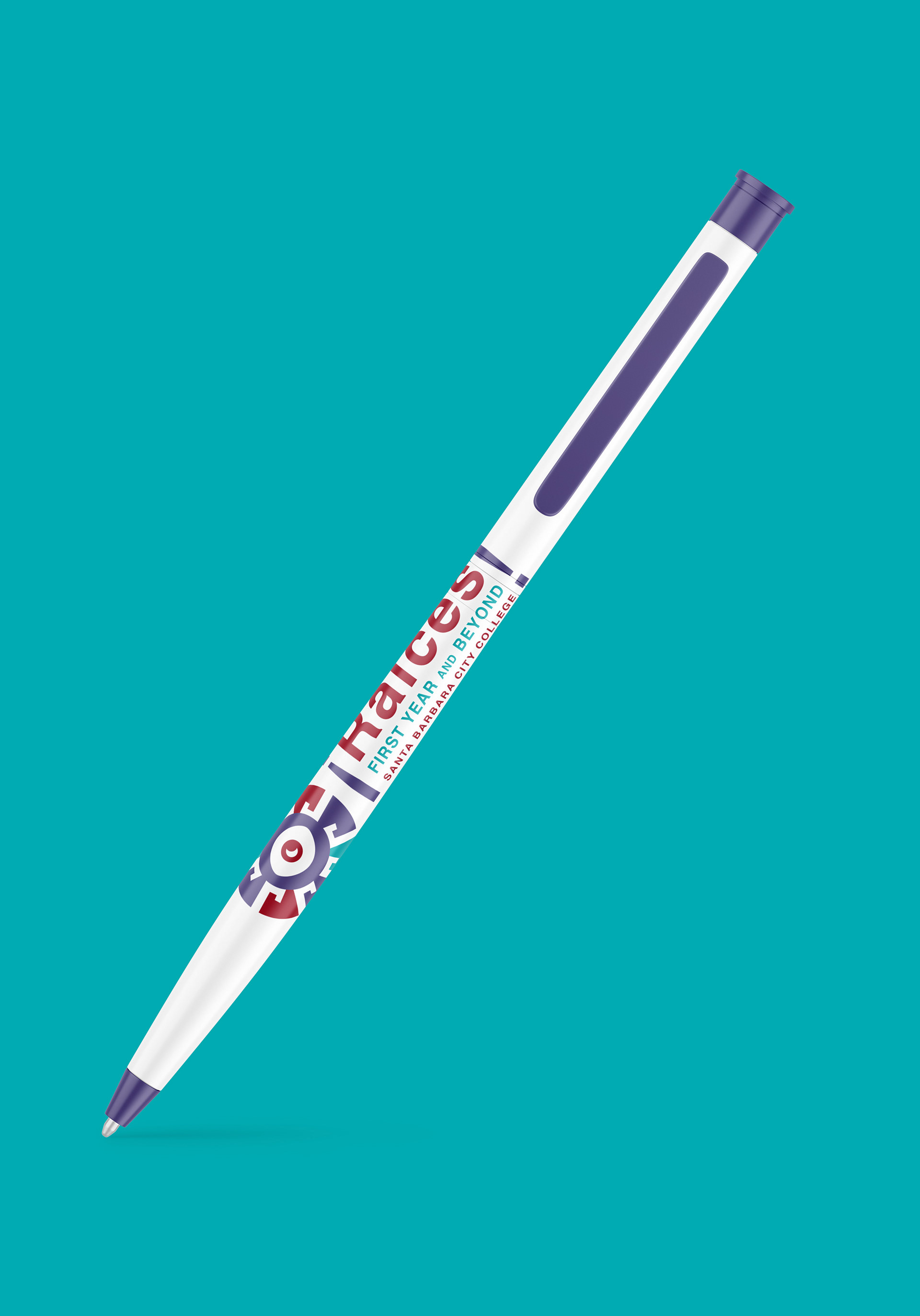
The brand identity includes a primary logo (shown above), two secondary logos with type, and a full-color palette. To follow Santa Barbara City College (SBCC) design guidelines, the brand’s primary colors are black, white, and red. Teal and purple were added as accent colors to give Raíces a unique brand identity since these colors are rarely in other identities on the SBCC campus.
For more insight on the final logo design and my experience working with Raíces, please visit the links below to Raíces's main website and to an article written by Santa Barbara City College's student-run newspaper, The Channels.
04 BRANDED MATERIALS