Momentos Events Logo and Branding.
The project aims to create a logo and brand that embodies the client’s Mexican heritage and cultural roots in a classic, elegant manner. The client is a young event planning professional looking to expand her craft into an events business in Santa Barbara, California. She aims to establish a practice for constructing family-oriented events that foster intimate and memorable experiences for her clients and attendees.
Role: Art Direction, Logo Design, Brand Identity
Credits: Brenda Rodriguez (Client)
01 MOOD BOARD
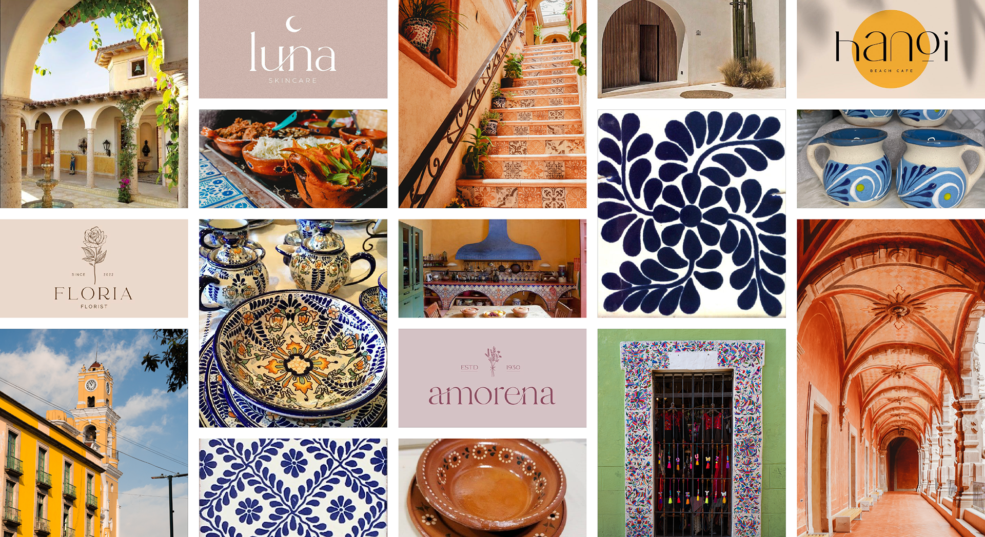
I drew inspiration from different art forms and styles unique to Mexico, specifically those seen in Mexican pottery, tile work, textiles, and architecture, notably Mexican Hacienda-style architecture. The client enjoys how simple and clean but subtly decorative the exterior of Hacienda architecture is and wanted this aesthetic built into her company’s brand.

02 PROCESS SKETCHES AND DRAFTS
Similar to the Hacienda, the client wanted a logo design that was minimal and compact. However, she preferred the logo not to abide by a strict geometric form (i.e., a circle or square). During the ideation step, I explored different logo shapes and forms, using the floral/foliage motifs and leaf patterns seen on Mexican pottery and tile designs for inspiration. I focused on mirroring the fluidity seen in the patterns, attempting to imbue potential designs with playful movement and break away from any strict geometric forms.
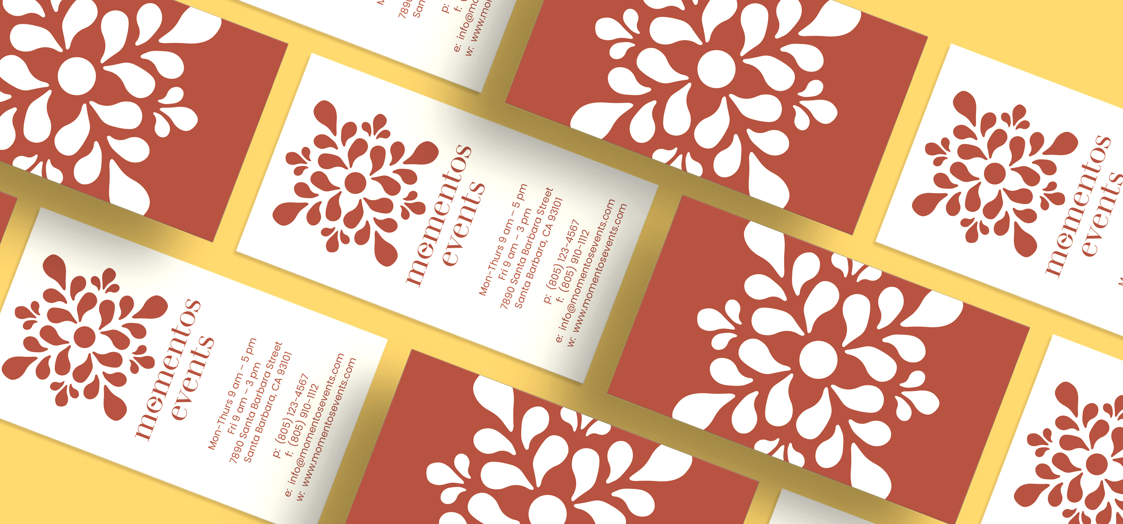
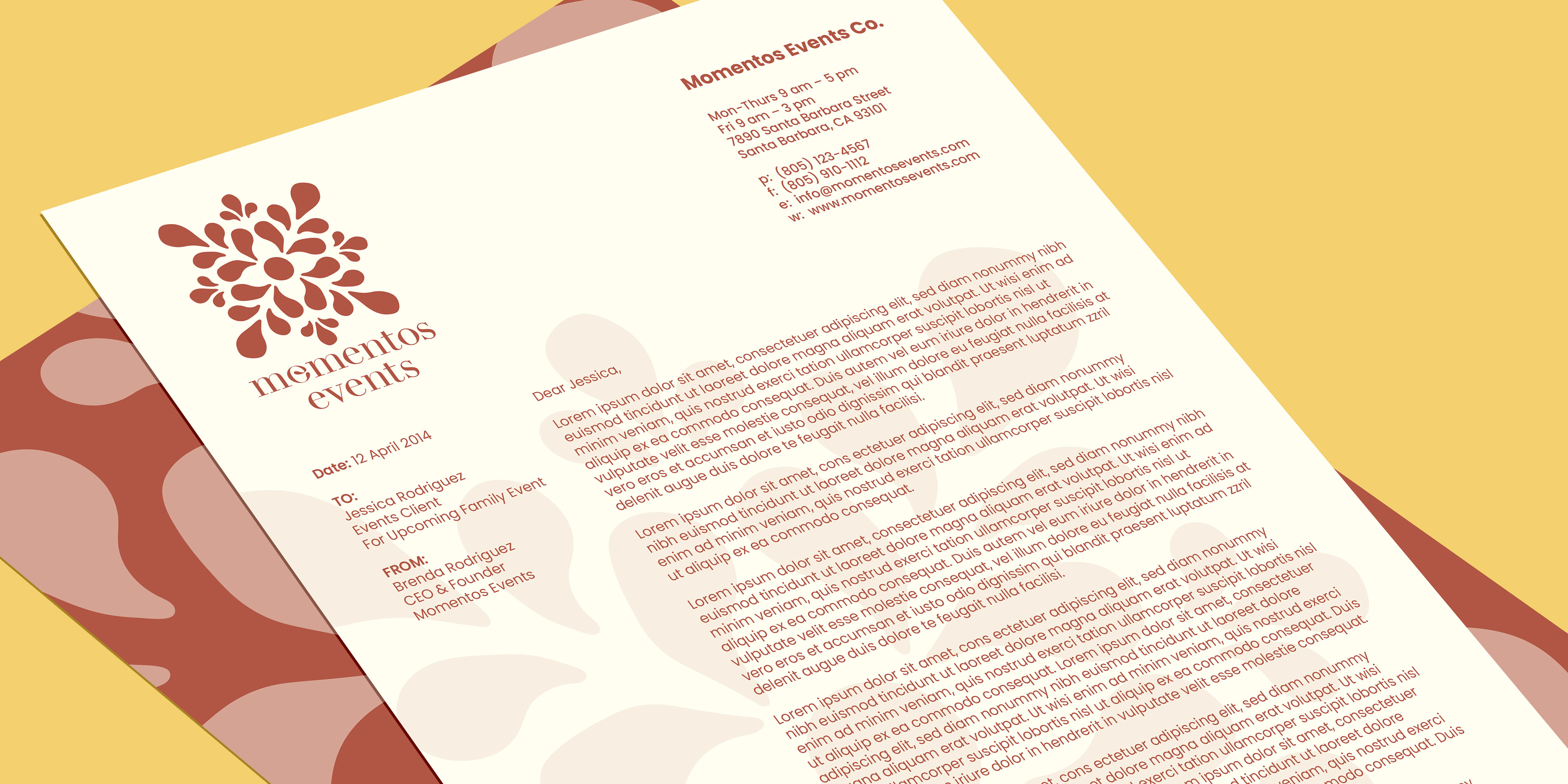
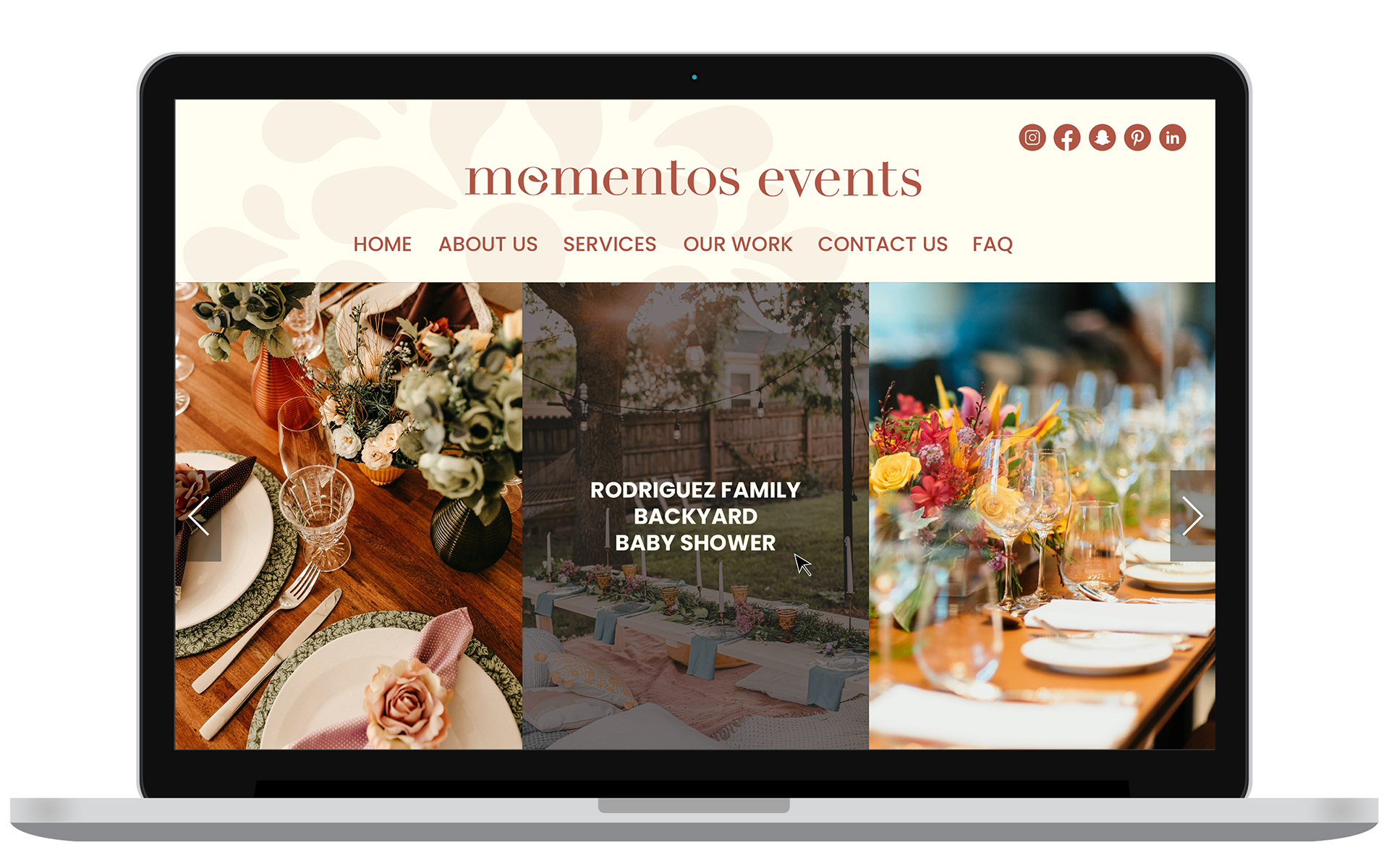
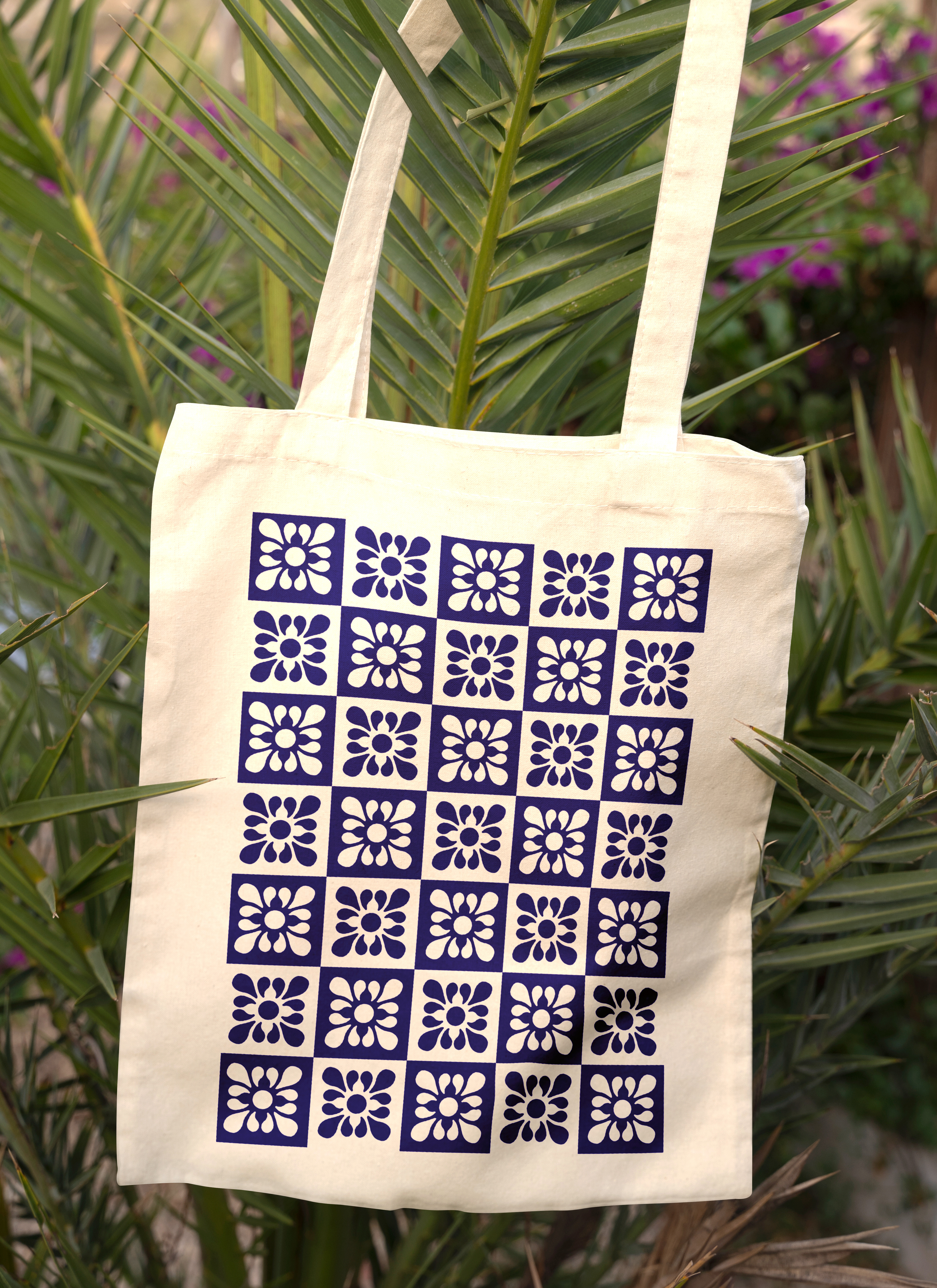
03 FINAL COMPANY LOGO AND BRANDING
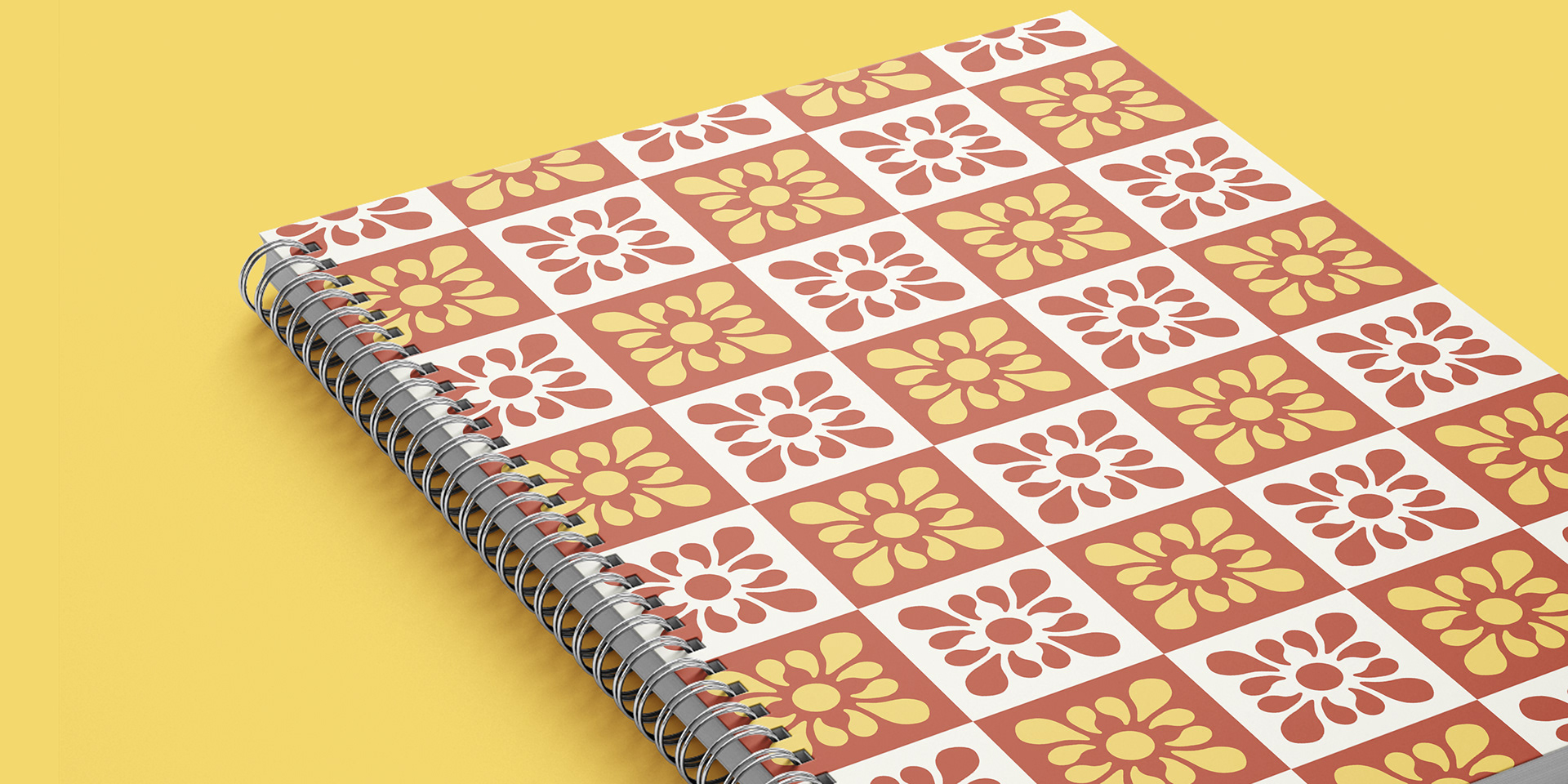
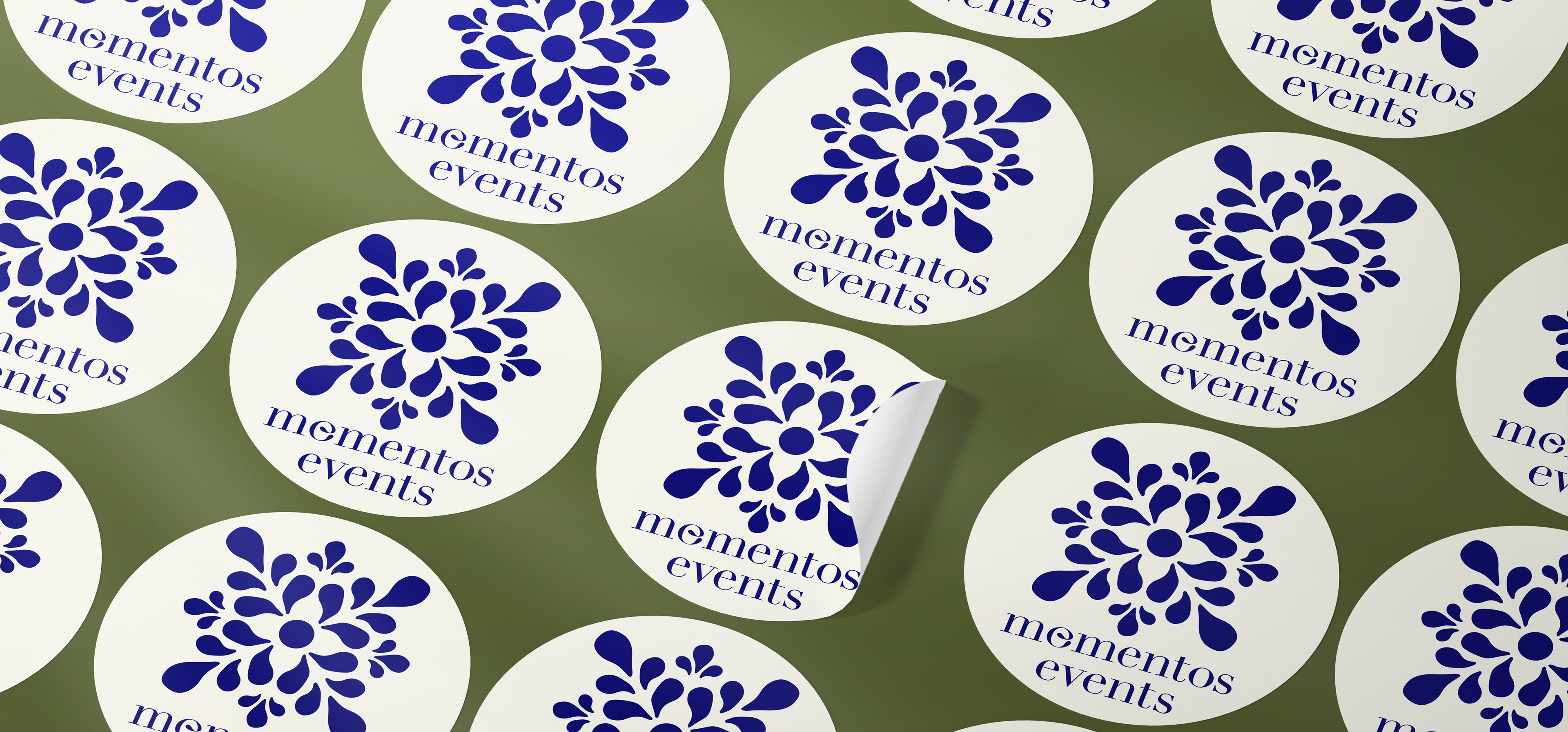
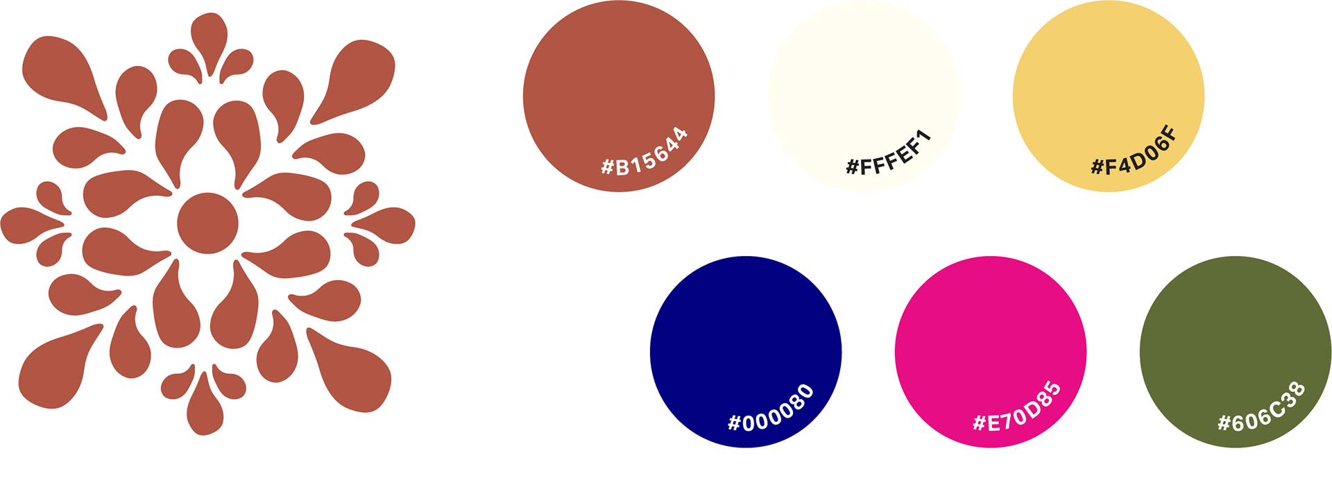
The brand package for Momentos Events contains a primary logo design, which includes three additional logo versions with type, a pattern design, and a full-color palette. When speaking with the client, she describes her vision for the brand’s personality as vibrant but not loud, warm, minimal, and lively. I chose colors that fit within the personality the client strived for but also derived from my research of Mexican architecture, pottery, and textiles.
Many of the colors seen in these art forms inspired the vibrant but subtle color palette for Momentos. The client was particularly keen on featuring a terracotta-like brown to pay homage to the Mexican red clay pottery she grew up using at home. The terracotta brown, cream white, soft yellow, and navy are the primary colors for the branding, while the Mexican pink and forest green are accent colors.
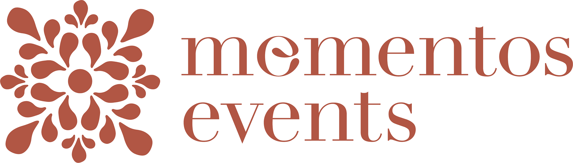
In the word momentos, the second character has a dual purpose, acting as an o and e. The dual function allows the word read as momentos, the Spanish translation for moments, and the English word, mementos, meaning something that serves as a reminder. Momentos strives to create intimate moments that become long-lasting life mementos for their clients. This feature taps into the company's mission and gives the design a bilingual quality.
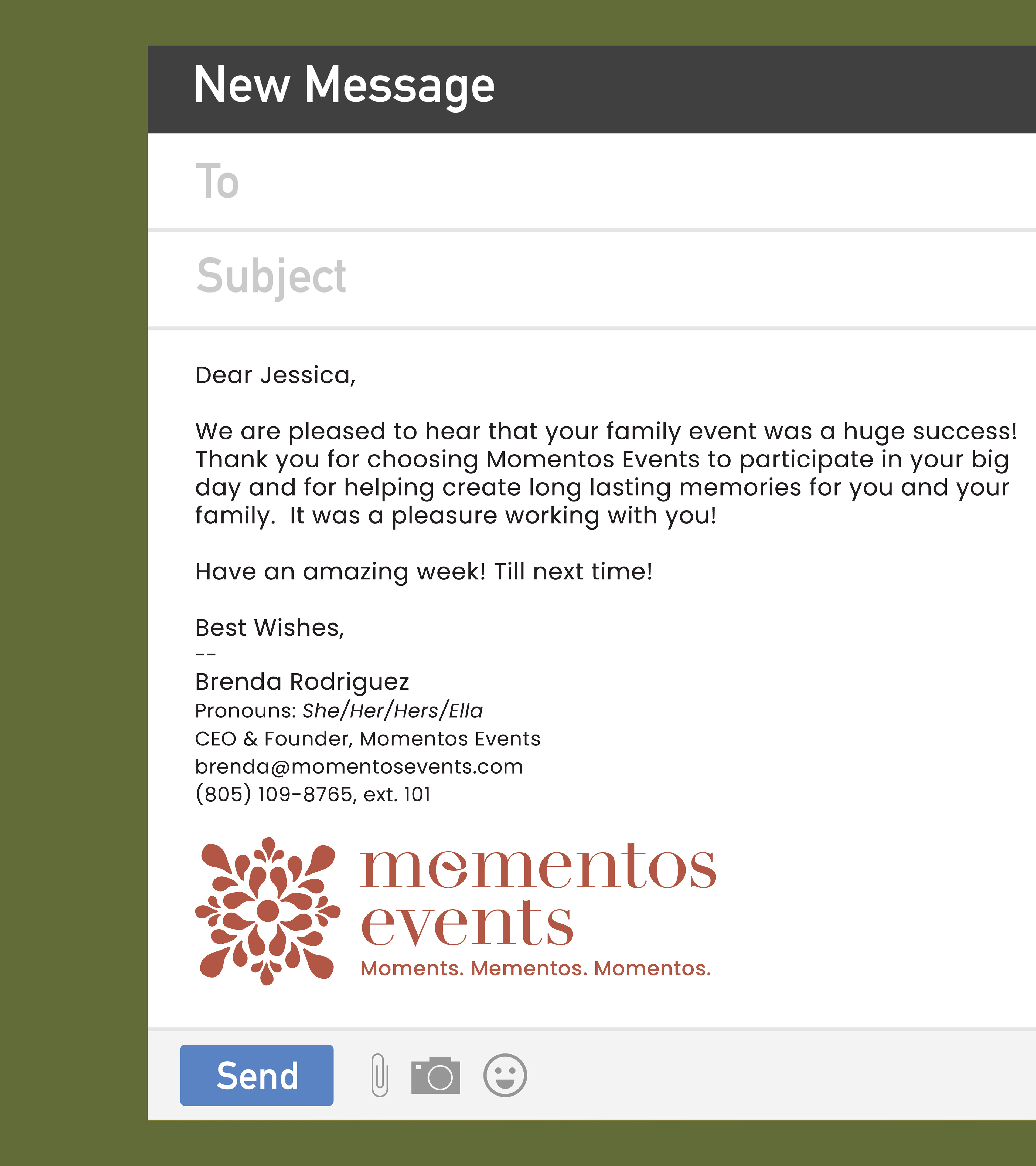
04 BRANDED MATERIALS